The color wheel is an essential tool in art and design, serving as a visual representation of how colors interact. The concept of complementary colors—those that sit opposite each other on the color wheel—is crucial for creating contrast and harmony in various creative projects. This article explores the principles of the color wheel, the significance of complementary colors, and practical applications for artists and designers.
Table of Contents
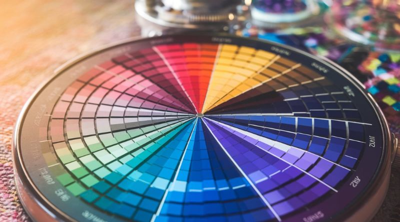
Understanding the Color Wheel
A color wheel typically consists of primary, secondary, and tertiary colors arranged in a circular format:
- Primary Colors: Red, blue, and yellow are the fundamental colors that cannot be created by mixing others. They form the foundation of the color wheel.
- Secondary Colors: These are created by mixing two primary colors. For example, mixing red and blue produces purple, blue and yellow create green, and yellow and red yield orange.
- Tertiary Colors: These are formed by mixing a primary color with a secondary color, resulting in hues like red-orange and blue-green.
The color wheel helps artists and designers visualize color relationships and make informed decisions about color combinations.
The Concept of Complementary Colors
Complementary colors are pairs of colors that, when combined, cancel each other out, producing a grayscale color (black, white, or gray). They are located directly opposite each other on the color wheel. Here are some classic complementary pairs:
- Red and Green
- Blue and Orange
- Yellow and Purple
Using complementary colors in design creates a striking contrast that can enhance visual interest and guide the viewer’s attention.
Importance in Design
Complementary colors play a vital role in various design fields, including:
- Art: Artists often use complementary colors to create dynamic compositions. The contrast between complementary pairs can evoke emotions and enhance the vibrancy of the artwork.
- Graphic Design: In graphic design, complementary colors can help draw attention to specific elements, improve readability, and create a visually appealing layout.
- Interior Design: Complementary color schemes can make spaces feel balanced and harmonious, combining warm and cool tones to create inviting atmospheres.
Practical Applications of Complementary Colors
When incorporating complementary colors into your work, consider these tips:
- Balance: Use one color as the dominant hue and its complement as an accent to create a visually pleasing composition.
- Tints and Shades: Experiment with lighter or darker variations of complementary colors to add depth and dimension to your design.
- Context Matters: Think about the mood you want to convey. Different combinations can evoke various feelings, so choose colors that align with your message.
FAQs
1. How do I find complementary colors on a color wheel?
To find complementary colors, simply locate a color on the wheel and look directly opposite it. That color will be its complement.
2. Can I use complementary colors in all types of design?
Yes, complementary colors can be effective in various design types, from digital art to print media and interior spaces. However, it’s essential to balance them to avoid overwhelming the viewer.
3. What if I want a subtler look?
If high contrast isn’t desired, consider using analogous colors (colors next to each other on the wheel) or adjusting the saturation and brightness of your complementary colors.
4. Are there tools to help me choose complementary colors?
Yes, there are many online tools and apps available that can assist you in selecting complementary colors. These color palette generators can provide helpful suggestions based on the color wheel.
5. Do complementary colors have the same meaning across cultures?
While the principles of complementary colors are universal, cultural associations with colors can vary. It’s important to consider the cultural context when designing for specific audiences.
Conclusion
The concept of complementary colors, as illustrated by the color wheel, is a powerful tool in the worlds of art and design. Understanding how these colors interact can enhance your creative projects, making them visually striking and engaging. Whether you’re an artist, designer, or simply interested in color theory, mastering complementary colors will elevate your work and deepen your appreciation for visual composition.